You’ll soon notice a new MECA logo on communications from the Michigan Electric Cooperative association.
“Our logo had a tired, dated feel that doesn’t reflect the energy of MECA today,” commented CEO, Craig Borr, about the MECA logo that had been in use since the 1980’s. “MECA has transformed the way it does business in recent years, and we’ve made significant improvements to the quality of services provided to our members and partners.”
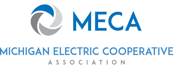
While the new logo retains many of the same basic shapes and colors, the REA-era lightning bolts have been replaced with four synergetic pieces that change in color intensity to represent energy, transformation and ongoing improvement. Individually, the four pieces also represent each of the association’s core services: legislative and regulatory support, safety and job training, communications (including Michigan Country Lines magazine), and Energy Optimization programs.
“MECA and the member co-ops have worked hard to build relationships with the legislature and others,” says assistant general manager, Doug Snitgen. “We wanted to refresh the logo without losing any of that hard-earned brand recognition, but we also wanted there to be meaning behind the redesign.”
The new branding has been timed to coincide with MECA’s move from its current headquarters office in Okemos to a downtown Lansing location near the Capitol. “Our new location will reflect a positive image for the co-ops, and allow the MECA team to be even more engaged with the state legislature,” comments Borr.
The transition to the new office (201 Townsend St., Suite 900, Lansing, MI 48933) is scheduled to be complete by early fall.
Craig, I see that you are returning to Lansing. Your close proximity to the Capitol should be to your advantage.
My best to you and MECA at your new location.
Mark Harper, CFC, Retired.